
The spring season, often associated with vibrancy and renewal, has paradoxically ushered in a distinctive trend within the K-pop music video landscape: a pronounced artistic inclination towards monochromatic or highly restricted color palettes. While traditionally a time for bright, effervescent visuals, many of this season’s comebacks have opted for a more subdued, yet profoundly impactful, approach, leveraging black, grey, white, and limited color schemes to deepen their narratives and amplify emotional resonance. This deliberate selectivity in color, far from being a limitation, has proven to be a potent tool for visual storytelling, demonstrating the wide artistic range and sophisticated production values prevalent in the industry. This analysis delves into how several prominent spring comebacks have innovatively utilized color—or its absence—to craft creative and memorable music videos, moving from the darkest to the most subtly colorful expressions.
The Spectrum of Shadow – Delving into Desaturated Tones
The journey into this season’s visual trends begins with music videos that embrace a stark, desaturated aesthetic, using muted tones to convey raw emotions and complex themes. This stylistic choice creates a powerful atmosphere, drawing viewers into the intricate narratives presented by the artists.
Wheein – “The Symphony of Fxxkboys”
Few K-pop music videos from recent memory plunge into such a gritty, desaturated realm as Wheein’s "The Symphony of Fxxkboys." Marking her first foray into the rock genre, the cinematic MV establishes a pervasive sense of grime and melancholy. Its color palette is rigorously restricted, predominantly featuring black and grey, punctuated only by subtle, muted pops of blue and yellow that appear almost accidental against the dominant gloom. This visual grunginess is not merely aesthetic; it perfectly mirrors the raw, all-English pop-rock ballad’s focus on the toxicity and emotional turmoil of a relationship with a "fuckboy." Wheein’s emotive vocal delivery, a hallmark of her artistry, finds a compelling visual counterpart in the MV’s starkness.
The narrative scope of the music video extends far beyond the central relationship, weaving in parallel plot lines that explore profound societal issues such as social isolation, bullying, and child neglect. One of the most haunting sequences depicts a young girl seemingly left alone, her home a disarray of discarded clothes and snack bags—a poignant visual metaphor for abandonment and unmet needs. The scene culminates in her piling potato chips into a shopping cart, reaching an absurd height, powerfully evoking the accumulation of trauma she endures. In contrast, the second half of the MV introduces a diverse cast of individuals converging under a bridge, a subtle yet potent symbol of shared vulnerability and the nascent potential for collective healing. This juxtaposition of individual suffering and communal solace, underscored by the MV’s stark visuals, transforms the song into a broader commentary on resilience and the universal human experience of pain and connection. The deliberate choice of a desaturated palette ensures that the focus remains on the emotional weight of these narratives, rather than being distracted by vibrant hues.
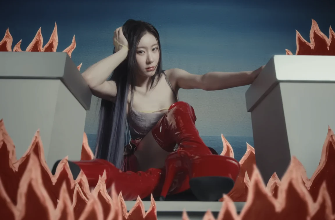
Taeyong – “Wyld”
NCT’s Taeyong, known for his experimental solo endeavors, delivered a similarly impactful visual experience with his comeback, "Wyld." The music video opens in a purely steely black and white, immediately setting a tone of stark intensity. As the title suggests, the MV delves into primal, animalistic desires, replete with visual motifs of ants, scorpions, and snakes. Taeyong himself embodies this wildness, seen crawling on the floor and emitting guttural "uh" sounds in the post-chorus, reinforcing the raw, untamed essence of the track.
A significant visual shift occurs after the first verse, where the color red dramatically saturates the screen, becoming the dominant hue. This transition is highly symbolic, moving from the starkness of primal instinct to the undeniable intensity of carnal pleasures and temptation. The MV cleverly twists elements of Greek mythology and biblical stories, portraying Taeyong as an active participant who willingly indulges in forbidden fruits—the pomegranate and the apple—rather than being passively tempted. This proactive engagement with temptation further emphasizes the "wyld" nature of his character.
Musically, "Wyld" mirrors its visual unpredictability. It shifts fluidly from growling, laid-back rap verses to a sing-talking "La la la la la" refrain in a lower register. While this refrain might initially feel minimalist, a melodic second chorus and an extended bridge build an escalating tension, culminating in an explosive final chorus. This musical crescendo is visually matched by a scene where Taeyong appears to be reborn into a new, powerful form. The return of the "la la la’s" in this powerful finale provides a satisfying resolution, demonstrating Taeyong’s ability to fuse disparate song elements into a cohesive and impactful artistic statement, solidifying his distinct solo identity. The strategic use of color amplifies this journey of transformation and indulgence.
Regal Hues and Empowering Narratives
Moving from the stark desaturation, some artists this spring have chosen a limited but rich color palette, particularly jewel tones, to evoke elegance, power, and a unique artistic identity.
Xlov – “Serve”
Xlov’s "Serve" is a masterclass in cultivating a unique artistic identity through both sound and visuals. The track itself is a smooth, midtempo chill house anthem, characterized by breathy vocals and sophisticated beats that project an aura of effortless elegance. This elegance is visually reinforced through sumptuous styling and a production design rich in jewel tones, firmly establishing a royal concept that permeates the entire music video.
The MV ingeniously references their debut track, "I’mma Be," specifically recalling its chess board motif. Where the debut depicted a member as a pawn being eliminated by a knight, "Serve" reverses this dynamic. An early scene shows member Wumuti advancing a knight piece to the end of the board, symbolizing a strategic progression. Later, Hyun appears wielding a sword, embodying strength and agency. The inclusion of actress Han Sohee as a scared, pawn-like character fleeing an unseen threat into Xlov’s castle adds a layer of narrative depth. As Xlov embraces her, she undergoes a transformation, gaining personal power and eventually wielding a sword herself, mirroring Hyun. This powerful narrative arc is underscored by Wumuti’s teaser narration: "When a pawn reaches the end of the board, it can be reborn as anything it chooses." This message of reinvention and empowerment is central to Xlov’s artistry.
The group’s decision to incorporate voguing into "Serve" for the first time is particularly significant. Historically, voguing has been a powerful form of expression and empowerment for queer people of color, a dance form rooted in self-assertion and identity. Xlov’s adoption of voguing, alongside the chess metaphor, directly champions self-confidence and personal agency. These values are integral to Xlov’s group identity, as they consistently push K-pop norms with their genderless concept, challenging conventional perceptions and advocating for a broader definition of artistry and identity within the industry. The regal jewel tones and sophisticated set design enhance this message of refined power and self-actualization.
Vibrant Statements and Unfiltered Expressions
Some comebacks this spring utilized a specific, complementary color scheme to make a bold, unapologetic statement, embodying a raw and energetic artistic ethos.
Cortis – “RedRed”
Cortis made a striking comeback with "RedRed," arguably their strongest track to date. While retaining elements of their signature rage hip-hop, characterized by heavy autotune and repetitive hooks seen in tracks like "Fashion," "RedRed" distinguishes itself with a particularly infectious electroclash instrumental. The accompanying "conceptual performance film" further elevates the song’s catchiness with memorable point choreography, fluid formation changes, and precise footwork, showcasing a refined yet still raw energy.
True to its title and the EP title GreenGreen, the music video’s color palette primarily revolves around the complementary hues of red and green. A slightly gritty green tinge pervades the visuals, adding an edgy, unfiltered quality. This deliberate color scheme directly aligns with the song’s lyrical content: red is assigned to ideas Cortis opposes, such as inauthenticity and conformity, while green represents their core values of freedom and creativity.
Cortis frequently injects unapologetic silliness into their work, as evidenced by lyrics like "covering your butt is red." The MV echoes this unserious vibe, depicting the members playfully interacting in everyday public spaces like restaurants and arcades. The visual style often appears chaotic and deliberately amateurish, employing rapid jump cuts, repeated shots, freeze frames, and frenetic camera movements. This seemingly raw and unpolished aesthetic is, in fact, highly intentional, mirroring Cortis’s unique appeal. Their work, while appearing spontaneous, is meticulously crafted to convey a fun, rebellious, and authentic energy, making "RedRed" a vibrant and unfiltered statement within the spring comeback landscape.
Journeys of Resilience and Rebirth
The narratives of personal struggle, perseverance, and transformation are beautifully articulated through nuanced color grading and symbolic visuals in other spring releases.
Lee Chaeyeon – “No Tears on the Dance Floor”
April saw a significant and deeply personal comeback from Lee Chaeyeon, her first since enduring a serious spinal injury and subsequently concluding her contract with WM Entertainment. Now under a new label, Day One Dream, her return with "No Tears on the Dance Floor" is a powerful testament to her resilience. The song, featuring her own lyrics, directly addresses the hardships she has overcome, portraying the dance floor as a sacred refuge from personal pain and a symbol of unwavering perseverance.
The music video’s color grading is meticulously crafted to dramatize these themes. During the more vulnerable verses, Chaeyeon is often bathed in hues of green or blue, confined within enclosed spaces such as a photo booth or a subway platform. These colors and settings evoke a sense of introspection, isolation, and emotional fragility. In stark contrast, the chorus scenes illuminate Chaeyeon in bright, empowering light, showcasing her in her element on the dance floor. This visual dichotomy powerfully illustrates her journey from vulnerability to strength, from confinement to liberated expression.
The dance-pop track itself masterfully highlights Chaeyeon’s strengths, particularly focusing on her chest voice to showcase her distinct tone. The song culminates in a disco-influenced instrumental outro, providing the perfect stage for her much-lauded dancing abilities. "No Tears on the Dance Floor" is more than just a song; it’s a poignant narrative capturing both her exceptional skills and her inspiring personal story. Warm, emotional, and expertly produced, it serves as a promising and triumphant reintroduction for Lee Chaeyeon, underscored by the deliberate use of color to chart her emotional landscape.
Itzy – “Motto”
Moving from Lee Chaeyeon to the group featuring her sister Chaeryeong, Itzy’s latest title track, "Motto," marks a notable shift in their musical direction. Recalling the upbeat, melodic synth-pop popular among 3rd generation K-pop girl groups like Twice and Iz*one, this nostalgic sound is a refreshing departure. The song is a fully developed pop track, replete with bursts of energy in the chorus, particularly the climactic final one after the bridge, providing a welcome sense of exuberance.
This sonic shift is mirrored visually by the MV’s pastel, painterly surrealism, moving away from Itzy’s recent darker title tracks. One can also discern influences from the members’ solo work, such as the dreamlike, candy-colored aesthetic of Yuna’s "Ice Cream" and the bright synths of Yeji’s "Air." Yet, "Motto" firmly asserts its place within Itzy’s established lineage. The MV ingeniously opens with a series of dioramas, miniature sets meticulously recreated from Itzy’s past music videos, from "Dalla Dalla" to "Sneakers." The final diorama transitions seamlessly into the white castle that serves as the primary setting for the rest of "Motto," symbolizing continuity and evolution.
In the past, Itzy frequently concluded their music videos with a signature crown pose, a powerful symbol of their brand of self-confidence. "Motto" foregoes this specific move, instead portraying the construction of a castle using seemingly handcrafted sets. This imagery beautifully reflects the lyrics’ sentiments: that love and support from their fans make them "fearless," even when they feel "alone and so lost in the dark." "Motto" thus transforms into an affectionate tribute to their fanbase, acknowledging them as the foundational source of the group’s unwavering confidence. The vibrant yet soft pastel palette of the MV underscores this message of comfort, growth, and enduring connection.
Embracing the Full Palette – Harmony in Life’s Complexities
Finally, some artists, while not strictly limiting their palette, utilize a specific atmospheric grading to convey deep emotional narratives, embracing the full spectrum of human experience.
AkMu – “Joy, Sorrow, A Beautiful Heart”
Unlike many of the other music videos this season that deliberately restrict their color palettes, AkMu’s "Joy, Sorrow, A Beautiful Heart" allows for the full spectrum of colors. However, the MV is predominantly bathed in a soft, diffused morning light, creating an earthy and calming effect. This aesthetic perfectly complements the song’s tender message. Penned by Lee Chanhyuk to aid his sister Suhyun in her recovery from a period of depression, the ballad finds a compelling visual narrative in the MV, which gradually transitions from Suhyun’s initial isolation to her reconnection with community and joy.
The scenes of AkMu and their friends engaging in artistic creation, frolicking playfully in costumes, and collaboratively planting a tree in a desert landscape masterfully balance warmth with whimsy. Another particularly poignant scene depicts the group posing for a photograph, evoking a gentle melancholy as Chanhyuk sings over a piano outro. These shifting tones within the MV perfectly align with the chorus, sung in harmonious duet by Chanhyuk and Suhyun:
"Your tears in harmony with your laughter
Nothing in the world is better than this
Cloudy days, sunny days, aching days
Fit them together piece by piece and you’ll see the completed puzzle"
The lyrics profoundly acknowledge that both joy and sorrow are integral components of the human experience, each necessary for the "completed puzzle" of life. Even as the MV concludes with a symbolic cataclysm, the overarching message remains one of profound comfort and affirmation. "Joy, Sorrow, A Beautiful Heart" beautifully asserts the preciousness of life, embracing its cloudy, aching, and even its final days as essential to its beauty. The soft, natural lighting and earthy tones reinforce this message of holistic acceptance and the inherent beauty in life’s complexities.
Conclusion: The Evolving Canvas of K-Pop Visuals
This spring comeback season has offered a fascinating insight into the evolving artistry of K-pop music videos, particularly through the nuanced and impactful use of color. From the stark, desaturated landscapes of Wheein and Taeyong, which delve into raw emotion and primal instincts, to the regal jewel tones of Xlov, symbolizing empowerment and reinvention, and the vibrant, rebellious red and green of Cortis, challenging conformity, each artist has leveraged their chosen palette to enhance their narrative. Lee Chaeyeon’s emotional journey of resilience, depicted through contrasting light and shadow, and Itzy’s pastel surrealism celebrating fan connection, further exemplify this visual mastery. Finally, AkMu’s warm, earthy tones embrace the full spectrum of human experience, finding beauty in both joy and sorrow.
This trend underscores the K-pop industry’s commitment to sophisticated visual storytelling, where music videos are not merely promotional tools but intricate works of art. The deliberate choice to limit or carefully grade color palettes demonstrates a growing artistic maturity, allowing themes of trauma, identity, perseverance, and emotional complexity to resonate more deeply. These visual strategies contribute significantly to the artists’ branding and the broader narrative they wish to convey, proving that in K-pop, every visual detail is a brushstroke on an ever-expanding canvas of global influence. The collective impact of these diverse approaches highlights the dynamic and innovative spirit driving K-pop’s continued global appeal, proving that even in a season often associated with bright hues, the most profound stories can be told through a masterful command of light, shadow, and selective color.
(YouTube: @stonemusicent, @NCT, @XLOV, @CORTIS_official, @LEECHAEYEON_Official, @ITZY, @AKMU_official. Lyrics via Genius: ITZY "Motto", AKMU "Joy, Sorrow, A Beautiful Heart". Images via JYP Entertainment.)